Then we compared and contrasted an image of a circle and a sphere. What did the artist add to the sphere to make it look 3-D and not 2-D like the circle? Highlights and shadows! He/she used value to make it look 3-D!
I then have the kids draw a sun on a piece of white drawing paper near the top-middle part of the page. Then using soufflé cups as stencils, students are instructed to draw at least 3 circles on their page. Once this is completed, they will draw an arrow from the sun directly to their circle. This is where the highlight (tint) should go. Then I tell students the shadow (shade) will go on the opposite side. Using oil pastels, students color the entire circle with one solid color, then use white an black oil pastels to add their highlights and shadows. We talk about blending their pastels to REALLY make it look 3-D (although I found some of them really struggled to commit to blending).
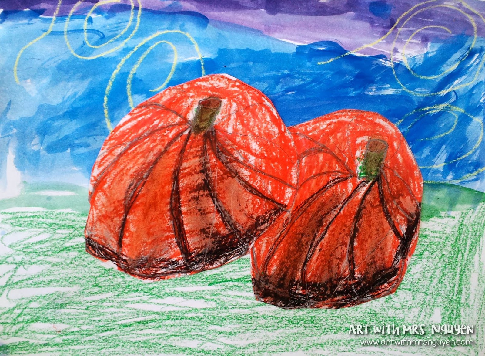
 The next day they come in, I start by giving the kids a new piece of paper and showing them step-by-step how to draw a pumpkin. First we draw two overlapping circles on a page, then erase one of the overlapping lines (so it now looks like one circle is in front of the other). Then we draw a cylinder shape inside our circles for the stem. Then we draw curved lines from the stem to the outside of the circle. I tell the students that if their line is on the right side of the pumpkin, it should curve to the right, and if it's on the left side, it should curve to the left. After we get all our lines on the page, I show students how they can make their pumpkin shape more realistic by connecting their lines at the bottom with a more rounded curve (it's like playing connect-the-dots, except it's connect-the-lines).
Afterwards, I demo how to add the oil pastel and again create highlights and shadows to their pumpkins. I knew going into this lesson that the concepts I was teaching them (especially with the pumpkin shape) was much better suited for 5/6th graders.. but I really wanted to see what my 2nd graders could do with it.
Once we colored our pumpkins, we cut them out and set them aside. Then on a new sheet of white drawing paper, we drew a variety of lines with crayons. The next day we used cool colored watercolors to fill our page - students were told to paint these however they'd like to with the cool colors.
Then on Friday, we glued our pumpkins down to our paintings and spent the rest of class practicing drawing 3-D shapes.
Overall I think they turned out really cute! Like I said, I think this project is much better suited for an older group of students.. but I am very proud of what my 2nd graders accomplished! :)